Petit Duc
Redesigning a sustainability platform’s digital presence to make complex climate data easier to understand—and easier to trust.
Petit Duc is a digital platform by Merisia that helps event organizers measure, understand, and reduce the carbon emissions associated with participant travel.
My team redesigned the website from the ground up to create a clearer, more trustworthy experience that could help event organizers quickly understand Petit Duc’s value and take the next step.



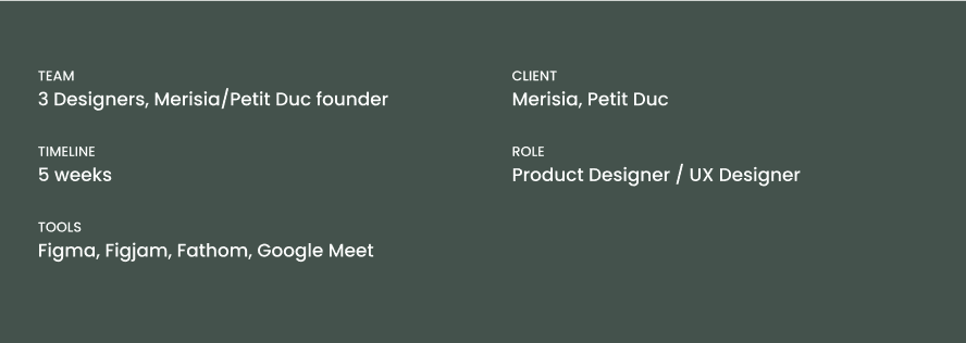
About the Project
A strong product was being communicated through an unclear experience.
Petit Duc addresses a complex problem: helping event organizers understand and reduce the environmental impact of participant travel
But the existing website made it difficult for a first-time visitor to quickly answer:
What exactly is Petit Duc?
How does it work?
Why should I trust its results?
What does this mean for my organization?
What should I do next?
The challenge wasn't simply to make the website look more modern.
Petit Duc addresses a complex problem: helping event organizers understand and reduce the environmental impact of participant travel
But the existing website made it difficult for a first-time visitor to quickly answer:
What exactly is Petit Duc?
How does it work?
Why should I trust its results?
What does this mean for my organization?
What should I do next?
The challenge wasn't simply to make the website look more modern.
DESIGN GOALS
Clearly communicate Petit Duc's sustainability value proposition
Reduce cognitive friction for first-time visitors exploring the platform
Increase conversion from landing page to booking inquiry
Make environmental data legible and emotionally compelling
Build trust through transparent impact metrics and social proof
RESEARCH AND DISCOVERY
User Research
Before designing the new experience, we wanted to understand how potential users think about sustainability, how they evaluate software like Petit Duc, and where the existing website was creating friction.
What we wanted to learn
We went into research with four main questions:
01 — Understanding the problem
How do event professionals currently think about measuring sustainability and participant travel?
02 — Understanding users
What information do they need before considering a sustainability platform?
03 — Understanding trust
What makes a B2B sustainability product feel credible and trustworthy?
04 — Understanding the existing website
Where do users become confused, and what information feels missing or difficult to find?
Research methods
User interviews with people connected to event planning, sustainability, and business decision-making
Competitive analysis
Review of the existing Petit Duc experience and existing website audit
Information architecture analysis

Research Findings
What we learned
01 — The value proposition needed to be clearer
Users needed to understand what Petit Duc actually does before they could understand why it mattered.
Design implication:
Lead with a simple explanation of the product and its value rather than sustainability terminology.
02 — Trust needed to appear earlier
Because Petit Duc deals with environmental data and business decision-making, users wanted evidence that the platform was legitimate and reliable.
Design implication:
Introduce credibility signals, product visuals, testimonials/case studies, and supporting information earlier in the journey.
03 — Too much technical language created friction
The subject matter is inherently complex, but users shouldn't have to understand carbon-accounting terminology before understanding the product.
Design implication:
Use plain language, progressive disclosure, and visual explanations to make complex information easier to digest.
04 — Users wanted to see the product
A marketing website can explain a product, but showing the product creates a much stronger understanding of what someone is actually getting.
Design implication:
Bring product UI and data visualization into the marketing experience rather than relying primarily on written descriptions.
Competitive Analysis
A structured comparison of mission, market positioning, pricing, and product capabilities across three leading platforms in the sustainable events space.
Petit Duc
Our Product
Mission
"Measure the carbon footprint of your events to better reduce it."
Target Market
Event organizers who want to measure and reduce their carbon impact.
Pricing
Essential
from 150€ / mo
Active
from 350€ / mo
Premium
from 480€ / mo
Strengths
›
Only event tool compliant with Bilan Carbone (BC+) methodology
›
Impressive roster of high-profile clients: Cannes Film Festival, LVMH, Stellantis, Air France & City of Paris
›
Explicitly built for event organizers with no technical expertise required
›
Built-in training & integrated e-learning path for general carbon challenges
›
Quick estimation scenarios to guide design decisions from early project phases
Weaknesses
›
Geographic & market concentration limiting global deployment
›
Pricing tier confusion between Essential, Active & Premium on main landing page
›
Self-reported industry benchmark raises third-party validation questions
›
Dependence on manual data input — accuracy tied to organizer diligence
EventCarbon
Competitor
Mission
"The definitive event carbon measurement platform for sustainable events."
Target Market
Event agencies, in-house corporate event teams, venue production suppliers, and freelancers.
Pricing
Event Carbon Measurement
from 65€ / mo
Business Operations
from 65€ / mo
All-in-One Emissions
from 116€ / mo
Strengths
›
Real-time dashboards generate live event impact reports for dynamic planning
›
Multi-event collaboration features with unique "Connections" tool for supplier security
›
Comprehensive waste tracking with volume profiling beyond industry averages
›
Strong standardization and reporting framework backed by industry-standard methodology
›
Focuses on measuring broader sustainability impacts beyond carbon
Weaknesses
›
UK/Europe-centric clientele built to ISO UK and EU standards only
›
Requires team upskilling to "Science of Measurement" training before use
›
Workflow can feel complex for smaller teams; more measurement
›
Agile updates and regulation tracking sometimes require cross-referencing external sources
EventCarbon
Competitor
Mission
"The definitive event carbon measurement platform for sustainable events."
Target Market
Event agencies, in-house corporate event teams, venue production suppliers, and freelancers.
Pricing
Event Carbon Measurement
from 65€ / mo
Business Operations
from 65€ / mo
All-in-One Emissions
from 116€ / mo
Strengths
›
Real-time dashboards generate live event impact reports for dynamic planning
›
Multi-event collaboration features with unique "Connections" tool for supplier security
›
Comprehensive waste tracking with volume profiling beyond industry averages
›
Strong standardization and reporting framework backed by industry-standard methodology
›
Focuses on measuring broader sustainability impacts beyond carbon
Weaknesses
›
UK/Europe-centric clientele built to ISO UK and EU standards only
›
Requires team upskilling to "Science of Measurement" training before use
›
Workflow can feel complex for smaller teams; more measurement
›
Agile updates and regulation tracking sometimes require cross-referencing external sources
Feature Matrix
Petit Duc
EventCarbon
EcoEvent Pro
Carbon Calculators
Collaborative Framework
Data Collection Checklist
~
Service Tiers
~
Shareable Deliverables
—
Event-Specific Carbon Footprint
Corporate Office Operations
~
—
Supplier Sustainability Data
~
Sustainability Action Planning
Measurement
—
✓
Full support
~
Partial / Limited
—
Not available
Turning Research into Design
From insights to opportunities
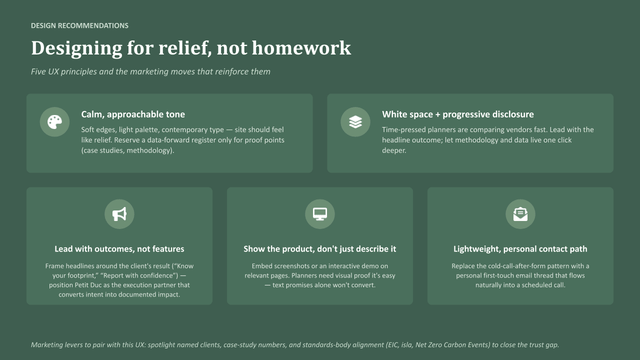
Rather than jumping directly from research into screens, we translated our findings into a few design principles.
Make the complex feel simple
Explain Petit Duc's value in plain language and use visuals to support comprehension
Build trust through evidence
Use product UI, data, social proof, and supporting information to establish credibility
Give visitors an immediate sense of what the platform looks like and how it works
Create a clear hierarchy so visitors can quickly find the information most relevant to them
Guide users toward action
IDEATION
User Personas

Sarah Thompson
GOALS
PAIN POINTS
KEY MESSAGES THAT RESONATE
BUYING TRIGGERS
When Sarah lands on the website, she wants immediate answers to:
ABOUT SARAH
42
20-150 employees
5-20 annually
1K-25K
Moderate
VP Events, Executive Director, or CEO
Senior Event Director
Sarah oversees large-scale conferences and public events. Her job is already complicated—budgets, sponsors, attendees, vendors, logistics, registrations, marketing, and stakeholder management.
Over the past few years, sustainability has become another expectation placed on her team. Sponsors ask for ESG metrics. Attendees increasingly care about environmental impact. Internal leadership wants sustainability reporting included in post-event reviews.
She knows participant travel is a major contributor to emissions but has no reliable way to measure it.
Doesn't know how to accurately calculate event emissions
Sustainability reporting feels complex and time-consuming
Existing carbon calculators feel overly technical
Limited internal expertise
Struggles to translate sustainability data into actionable decisions
Sponsor requests ESG reporting
New sustainability mandate from leadership
Bidding for grants or funding
Competitive pressure from other events
Measure your event's true carbon footprint
Understand attendee travel impact
Identify reduction opportunities
Produce credible sustainability reports
Simple enough for non-experts
What does this platform do?
How difficult is it to implement?
What data do I need?
How accurate are the results?
What actions can it help me take?
Who else is using it?
Can I see a demo?
Deliver successful events on time and on budget
Demonstrate measurable sustainability progress
Meet sponsor and stakeholder expectations
Differentiate her event from competitors
Build sustainability into future planning decisions
AGE
JOB TITLE
ORGANIZATION SIZE
EVENTS
ATTENDANCE
REPORTS TO
SUSTAINABILITY EXPERTISE
"I need a simple way to understand where our emissions come from and what actions will actually reduce them."

Marc Dubois
GOALS
PAIN POINTS
KEY MESSAGES THAT RESONATE
BUYING TRIGGERS
When Marc lands on the website, he wants immediate answers to:
ABOUT MARC
47
Works for a destination organization or tourism association
Oversees sustainability initiatives across multiple stakeholders
Responsible for regional reporting and funding applications
Destination Sustainability Manager
Marc isn't organizing a single event.
He's trying to improve sustainability performance across an entire destination ecosystem.
His organization supports dozens or hundreds of events annually and wants consistent measurement methodologies across all partners.
Every event measures sustainability differently
Difficult to compare results across organizations
Limited visibility into collective impact
Lack of standardized reporting
Sustainability certification initiatives
Regional climate commitments
Tourism board mandates
Government funding requirements
Scale sustainability measurement across your territory
Standardize reporting
Benchmark event performance
Support local organizers with actionable data
Can this work across multiple organizations?
Can we aggregate reporting?
Is the methodology credible?
How scalable is implementation?
Establish destination-wide sustainability benchmarks
Support local event organizers
Produce aggregated reporting
Demonstrate progress to government agencies
Strengthen destination competitiveness
AGE
JOB TITLE
"I need a consistent framework that all our event partners can use."
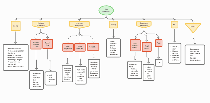
Site Navigation
Moodboard
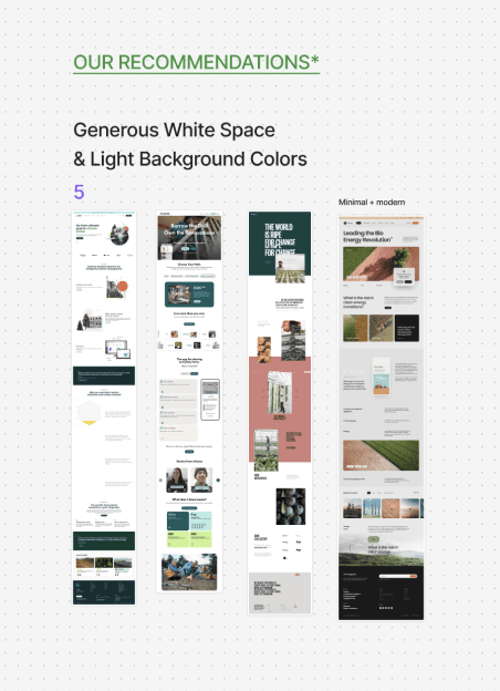
We created an initial collaborative moodboard, where we collected inspiration from existing websites, including interface patterns, color palettes, typography, imagery, illustration styles, and other visual elements that could inform the redesign.
We then organized our references into four visual directions: illustration-focused, imagery-focused, typography/content-focused, and our team's recommendations. Grouping the inspiration this way helped us identify common visual themes and compare different approaches rather than committing to a direction too early.
After exploring a range of possibilities, we created a second moodboard to narrow down the visual direction with the owner of Petit Duc. We presented a more focused selection of styles and discussed what felt most aligned with the brand, product, and goals for the new website.



DESIGN SYSTEM
From Wireframes to a Visual System
Once the structure was validated, we began exploring the visual direction.
The goal was to create a visual language that felt:
Credible · Sustainable · Modern · Data-driven · Approachable
Rather than relying on generic "green sustainability" visual language, we used the interface itself to communicate the product's data-driven nature.
Petit Duc
UI Kit
Color Palette
#E2E2E2
Gray
Secondary
#F5F5F5
Light Gray
Secondary
#FCFCFC
White Background
Background
#1F2321
Forest Night
Foreground
#F5FBF3
Light Green
Secondary Green
#2D9A5D
Canopy Green
Primary Green
#3E4A40
Sage Green
Text color
Layout & Typography
HEADING
Figtree - 64pts Bold
SECTION
HEADERS
Figtree - 50 pts Semibold
SUBHEADING
Figtree - 32pts Semibold
BODY
Figtree - 20 pts Regular
BODY TEXT
LINE HEIGHT
24
SPACING BTWN
SECTIONS
80
SPACING BTWN
HEADER AND BODY
24
PADDING
24
ROUNDED
CORNER
8
MARGINS
120
LINE HEIGHT
40
Mobile Specifications
HEADING
Figtree - 44pts Bold
SECTION
HEADERS
Figtree - 32 pts Semibold
SUBHEADING
Figtree - 28pts Semibold
BODY
Figtree - 16 pts Regular
BODY TEXT
LINE HEIGHT
24
SPACING BTWN
SECTIONS
48 (top & bottom)
SPACING BTWN
HEADER AND BODY
24
PADDING
24
ROUNDED
CORNER
8
MARGINS
24
SECTION HEADER
LINE HEIGHT
44
Creating a reusable visual system allowed us to maintain consistency across the marketing site while giving the product a distinct visual identity. Components were designed to work together across different content types, from educational sections to product screenshots and conversion points.
WIREFRAMING
Low Fidelity Wireframes
With the content hierarchy established, we moved into low-fidelity wireframes to test how information could be prioritized across the experience.
At this stage, the goal wasn't to make the website look polished. It was to answer structural questions:
Is the value proposition immediately understandable?
Does the page tell a logical story?
Are important trust signals appearing at the right moments?
Can users scan rather than read every section?
Does the content naturally lead toward the next action?
Desktop
Mobile


WIREFRAMING
High Fidelity Wireframes


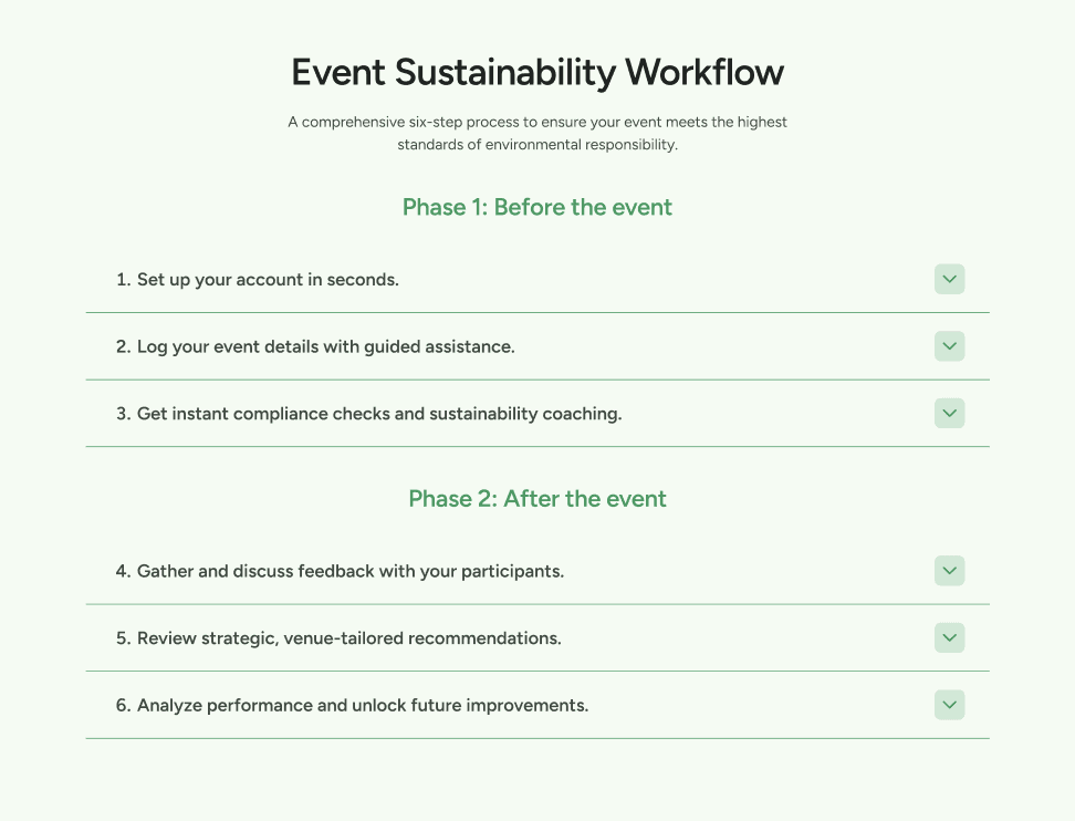
Homepage
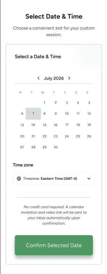
The homepage was designed as an introduction to Petit Duc's value, gradually moving visitors from understanding the problem → understanding the solution → seeing the product → building trust → taking action.

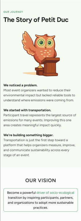
About / company story
The About experience was redesigned to give visitors more context about Merisia and the people behind Petit Duc, strengthening credibility and helping users understand the broader mission.
View Desktop Version
Mobile
View Mobile Version
From Information Overload to a Clearer Story
The final design wasn't simply a visual refresh. It was the result of translating research insights into a more intentional product story.
Before

The value of Petit Duc was difficult to understand quickly
Information felt dense and required more effort to navigate
Product capabilities were not immediately tangible
Trust and credibility were not established early enough
The experience did not clearly guide users toward the next step
After
The value proposition is introduced immediately
Information is organized around user questions
Product UI demonstrates the experience instead of only describing it
Trust-building content appears throughout the journey
Clear CTAs create a more intentional path toward conversion
A consistent design system creates a more credible and cohesive brand experience
The Key Takeaway
We shifted the website from simply explaining Petit Duc to helping visitors understand, trust, and
engage with the product.
TESTING AND ITERATIONS
Once we had a high-fidelity prototype, we tested the redesigned website with users to understand whether the new experience was clearer and easier to navigate than the original site. We focused on overall comprehension, visual clarity, navigation, and whether users could understand Petit Duc's purpose and value.
What we heard
The experience felt clearer and more straightforward
The visual direction resonated with users
The information was easier to understand
The flow still had opportunities for improvement

FINAL IMPACT
Project Outcome
We delivered a complete high-fidelity redesign of the Petit Duc marketing website that created a clearer connection between the product, its value, and the people it serves.
The redesigned experience:
Clarifies Petit Duc's value proposition
Makes complex sustainability information easier to understand
Builds credibility through product visuals and supporting evidence
Creates a more intentional information hierarchy
Establishes a cohesive and scalable visual system
Gives users clearer pathways toward learning more and engaging with the product
The final prototype gave Petit Duc a stronger foundation for communicating as a credible, approachable, and data-driven sustainability product.
What I Took Away
This project changed how I think about designing for complex products.
My biggest takeaway was when a product deals with complex information, the designer's role isn't to simplify the product itself. It's to create a structure that helps people understand the complexity without becoming overwhelmed.
I also learned the importance of connecting research directly to design decisions. The strongest parts of the final experience came from asking why users were confused, identifying what they needed to build confidence, and then translating those findings into hierarchy, content, flows, and UI.
What I would explore next
Test the redesigned experience with a larger group of event professionals
Measure conversion and engagement after launch
Continue refining the content based on real user behavior
Explore how the marketing experience could connect more directly with the product itself
Petit Duc
Redesigning a sustainability platform’s digital presence to make complex climate data easier to understand—and easier to trust.
Petit Duc is a digital platform by Merisia that helps event organizers measure, understand, and reduce the carbon emissions associated with participant travel.
My team redesigned the website from the ground up to create a clearer, more trustworthy experience that could help event organizers quickly understand Petit Duc’s value and take the next step.
ROLE
Product Designer / UX Designer
TEAM
3 Designers, Merisia/Petit Duc founder
TIMELINE
5 weeks
CLIENT
Merisia, Petit Duc
TOOLS
Figma, Figjam, Fathom, Google Meet
About the Project
A strong product was being communicated through an unclear experience.
Petit Duc addresses a complex problem: helping event organizers understand and reduce the environmental impact of participant travel
But the existing website made it difficult for a first-time visitor to quickly answer:
What exactly is Petit Duc?
How does it work?
Why should I trust its results?
What does this mean for my organization?
What should I do next?
The challenge wasn't simply to make the website look more modern.
DESIGN GOALS
Clearly communicate Petit Duc's sustainability value proposition
Reduce cognitive friction for first-time visitors exploring the platform
Increase conversion from landing page to booking inquiry
Make environmental data legible and emotionally compelling
Build trust through transparent impact metrics and social proof
RESEARCH AND DISCOVERY
User Research
Before designing the new experience, we wanted to understand how potential users think about sustainability, how they evaluate software like Petit Duc, and where the existing website was creating friction.
What we wanted to learn
We went into research with four main questions:
01 — Understanding the problem
How do event professionals currently think about measuring sustainability and participant travel?
02 — Understanding users
What information do they need before considering a sustainability platform?
03 — Understanding trust
What makes a B2B sustainability product feel credible and trustworthy?
04 — Understanding the existing website
Where do users become confused, and what information feels missing or difficult to find?
Research methods
User interviews with people connected to event planning, sustainability, and business decision-making
Competitive analysis
Review of the existing Petit Duc experience and existing website audit
Information architecture analysis

Research Findings
What we learned
01 — The value proposition needed to be clearer
Users needed to understand what Petit Duc actually does before they could understand why it mattered.
Design implication:
Lead with a simple explanation of the product and its value rather than sustainability terminology.
02 — Trust needed to appear earlier
Because Petit Duc deals with environmental data and business decision-making, users wanted evidence that the platform was legitimate and reliable.
Design implication:
Introduce credibility signals, product visuals, testimonials/case studies, and supporting information earlier in the journey.
03 — Too much technical language created friction
The subject matter is inherently complex, but users shouldn't have to understand carbon-accounting terminology before understanding the product.
Design implication:
Use plain language, progressive disclosure, and visual explanations to make complex information easier to digest.
04 — Users wanted to see the product
A marketing website can explain a product, but showing the product creates a much stronger understanding of what someone is actually getting.
Design implication:
Bring product UI and data visualization into the marketing experience rather than relying primarily on written descriptions.

Competitive Analysis
A structured comparison of mission, market positioning, pricing, and product capabilities across three leading platforms in the sustainable events space.
Petit Duc
Our Product
Mission
Helping event organizers measure, understand, and reduce the environmental footprint of their events through accessible carbon accounting and sustainability reporting tools.
Target Market
Event planners and organizers, corporate event teams, government agencies, nonprofit organizations, and tourism.
Pricing
Essential
1000€ / yr
Ultimate
3,500€ / yr
Pack Sur Mesure
Coming Soon
Strengths
›
Focuses specifically on event sustainability, creating a simpler experience
›
Measures emissions from attendee transportation and waste
›
Provides tools to communicate sustainability efforts to attendees and stakeholders
›
Aligns with the growing sustainable events market in Canada
›
Recurring events create opportunities for repeat use and long-term client relationships
Weaknesses
›
Website has gaps in product and company information
›
Limited information about the platform's full capabilities
›
Inconsistent English/French translation
›
Dependence on manual data input — accuracy tied to organizer diligence
Trace by Isla
Competitor
Mission
The definitive event carbon measurement platform for sustainable events
Target Market
Event agencies, in-house corporate event teams, venues, production suppliers, and freelancers
Pricing
Event Carbon Measurement
653€ / yr
Business Operations
653€ / yr
All-in-One Emissions
1,305€/yr
Strengths
›
Real-time dashboards generates live event impact reports
›
Supply chain collaboration features a unique multi-level "Connections" tool that lets suppliers directly securely log in and enter their own data.
›
Comprehensive waste tracking heavily emphasizes post-event waste management
›
Strong standardization and reporting framework
›
Focuses on meauring broader sustainabiliity impacts beyond carbon
Weaknesses
›
UK/Europe-centric clientele, it’s built by isla (a UK-based event industry body)
›
Reporting can feel complex for smaller teams
›
More measurement focused than action-oriented
›
To maximize the platform, users often need to go through their "Principles of Measurement" training to accurately map scopes
Climeet
Competitor
Mission
Measure the carbon footprint of your events to better reduce it
Target Market
Event organizers who want to measure and reduce their carbon impact
Pricing
Essential
from 150€ / mo
Advanced
from 315€ / mo
Premium
from 480€ / mo
Strengths
›
The only event tool compliant with the Bilan Carbone (BC-C) methodology
›
Impressive roster of high-profile clients
›
User-centric design for non-experts: it is explicitly built for event organizers
›
Climeet Express: quick estimation tool that allows organizers to run quick estimation scenarios
›
Built-in training: an integrated e-learning path helps onboard teams quickly
Weaknesses
›
Geographic & Market concentration: while the site mentions deployment in a few international hubs
›
Pricing tier between Essential, Advanced, & Unlimited are not clearly broken down
›
Dependence on Manual data input
›
Agile updates and regulation tracking sometimes require cross-referencing external sources
Feature Matrix
Petit Duc
Trace by Isla
Climeet
Carbon Calculators
Collaborative Framework
Data Collection Checklist
~
Service Tiers
~
Shareable Deliverables
—
Event-Specific Carbon Footprint
Corporate Office Operations
~
—
Supplier Sustainability Data
~
Sustainability Action Planning
Measurement
—
✓
Full support
~
Partial / Limited
—
Not available
Turning Research into Design
From insights to opportunities
Rather than jumping directly from research into screens, we translated our findings into a few design principles.
Make complex ideas feel simple
Explain Petit Duc's value in plain language and use visuals to support comprehension
Build trust through evidence
Use product UI, data, social proof, and supporting information to establish credibility
Give visitors an immediate sense of what the platform looks like and how it works
Create a clear hierarchy so visitors can quickly find the information most relevant to them
Guide users toward action
IDEATION
User Personas

Sarah Thompson
GOALS
PAIN POINTS
KEY MESSAGES THAT RESONATE
BUYING TRIGGERS
When Sarah lands on the website, she wants immediate answers to:
ABOUT SARAH
42
20-150 employees
5-20 annually
1K-25K
Moderate
VP Events, Executive Director, or CEO
Senior Event Director
Sarah oversees large-scale conferences and public events. Her job is already complicated—budgets, sponsors, attendees, vendors, logistics, registrations, marketing, and stakeholder management.
Over the past few years, sustainability has become another expectation placed on her team. Sponsors ask for ESG metrics. Attendees increasingly care about environmental impact. Internal leadership wants sustainability reporting included in post-event reviews.
She knows participant travel is a major contributor to emissions but has no reliable way to measure it.
Doesn't know how to accurately calculate event emissions
Sustainability reporting feels complex and time-consuming
Existing carbon calculators feel overly technical
Limited internal expertise
Struggles to translate sustainability data into actionable decisions
Sponsor requests ESG reporting
New sustainability mandate from leadership
Bidding for grants or funding
Competitive pressure from other events
Measure your event's true carbon footprint
Understand attendee travel impact
Identify reduction opportunities
Produce credible sustainability reports
Simple enough for non-experts
What does this platform do?
How difficult is it to implement?
What data do I need?
How accurate are the results?
What actions can it help me take?
Who else is using it?
Can I see a demo?
Deliver successful events on time and on budget
Demonstrate measurable sustainability progress
Meet sponsor and stakeholder expectations
Differentiate her event from competitors
Build sustainability into future planning decisions
AGE
JOB TITLE
ORGANIZATION SIZE
EVENTS
ATTENDANCE
REPORTS TO
SUSTAINABILITY EXPERTISE
"I need a simple way to understand where our emissions come from and what actions will actually reduce them."

Marc Dubois
GOALS
PAIN POINTS
KEY MESSAGES THAT RESONATE
BUYING TRIGGERS
When Marc lands on the website, he wants immediate answers to:
ABOUT MARC
47
Works for a destination organization or tourism association
Oversees sustainability initiatives across multiple stakeholders
Responsible for regional reporting and funding applications
Destination Sustainability Manager
Marc isn't organizing a single event.
He's trying to improve sustainability performance across an entire destination ecosystem.
His organization supports dozens or hundreds of events annually and wants consistent measurement methodologies across all partners.
Every event measures sustainability differently
Difficult to compare results across organizations
Limited visibility into collective impact
Lack of standardized reporting
Sustainability certification initiatives
Regional climate commitments
Tourism board mandates
Government funding requirements
Scale sustainability measurement across your territory
Standardize reporting
Benchmark event performance
Support local organizers with actionable data
Can this work across multiple organizations?
Can we aggregate reporting?
Is the methodology credible?
How scalable is implementation?
Establish destination-wide sustainability benchmarks
Support local event organizers
Produce aggregated reporting
Demonstrate progress to government agencies
Strengthen destination competitiveness
AGE
JOB TITLE
"I need a consistent framework that all our event partners can use."
Site Navigation
Moodboard
We created an initial collaborative moodboard, where we collected inspiration from existing websites, including interface patterns, color palettes, typography, imagery, illustration styles, and other visual elements that could inform the redesign.
We then organized our references into four visual directions: illustration-focused, imagery-focused, typography/content-focused, and our team's recommendations. Grouping the inspiration this way helped us identify common visual themes and compare different approaches rather than committing to a direction too early.
After exploring a range of possibilities, we created a second moodboard to narrow down the visual direction with the owner of Petit Duc. We presented a more focused selection of styles and discussed what felt most aligned with the brand, product, and goals for the new website.


WIREFRAMING
Low Fidelity Wireframes
With the content hierarchy established, we moved into low-fidelity wireframes to test how information could be prioritized across the experience.
At this stage, the goal wasn't to make the website look polished. It was to answer structural questions:
Is the value proposition immediately understandable?
Does the page tell a logical story?
Are important trust signals appearing at the right moments?
Can users scan rather than read every section?
Does the content naturally lead toward the next action?
Desktop
Mobile


DESIGN SYSTEM
From Wireframes to a Visual System
Once the structure was validated, we began exploring the visual direction.
The goal was to create a visual language that felt: Credible · Sustainable · Modern · Data-driven · Approachable
Rather than relying on generic "green sustainability" visual language, we used the interface itself to communicate the product's data-driven nature.
Petit Duc
UI Kit
Color Palette
#E2E2E2
Gray
Secondary
#F5F5F5
Light Gray
Secondary
#FCFCFC
White Background
Background
#1F2321
Forest Night
Foreground
#F5FBF3
Light Green
Secondary Green
#2D9A5D
Canopy Green
Primary Green
#3E4A40
Sage Green
Text color
Layout & Typography
HEADING
Figtree - 64pts Bold
SECTION
HEADERS
Figtree - 50 pts Semibold
SUBHEADING
Figtree - 32pts Semibold
BODY
Figtree - 20 pts Regular
BODY TEXT
LINE HEIGHT
24
SPACING BTWN
SECTIONS
80
SPACING BTWN
HEADER AND BODY
24
PADDING
24
ROUNDED
CORNER
8
MARGINS
120
LINE HEIGHT
40
Creating a reusable visual system allowed us to maintain consistency across the marketing site while giving the product a distinct visual identity. Components were designed to work together across different content types, from educational sections to product screenshots and conversion points.
WIREFRAMING
High Fidelity Wireframes
Homepage
The homepage was designed as an introduction to Petit Duc's value, gradually moving visitors from understanding the problem → understanding the solution → seeing the product → building trust → taking action.

About / company story
The About experience was redesigned to give visitors more context about Merisia and the people behind Petit Duc, strengthening credibility and helping users understand the broader mission.
View Desktop Version
Mobile
View Mobile Version
From Information Overload to a Clearer Story
The final design wasn't simply a visual refresh. It was the result of translating research insights into a more intentional product story.
Before
The value of Petit Duc was difficult to understand quickly
Information felt dense and required more effort to navigate
Product capabilities were not immediately tangible
Trust and credibility were not established early enough
The experience did not clearly guide users toward the next step
After
The value proposition is introduced immediately
Information is organized around user questions
Product UI demonstrates the experience instead of only describing it
Trust-building content appears throughout the journey
Clear CTAs create a more intentional path toward conversion
A consistent design system creates a more credible and cohesive brand experience
The Key Takeaway
We shifted the website from simply explaining Petit Duc to helping visitors understand, trust, and
engage with the product.
TESTING AND ITERATIONS
Once we had a high-fidelity prototype, we tested the redesigned website with users to understand whether the new experience was clearer and easier to navigate than the original site. We focused on overall comprehension, visual clarity, navigation, and whether users could understand Petit Duc's purpose and value.
What we heard
The experience felt clearer and more straightforward
The visual direction resonated with users
The information was easier to understand
The flow still had opportunities for improvement
FINAL IMPACT
Project Outcome
We delivered a complete high-fidelity redesign of the Petit Duc marketing website that created a clearer connection between the product, its value, and the people it serves.
The redesigned experience:
Clarifies Petit Duc's value proposition
Makes complex sustainability information easier to understand
Builds credibility through product visuals and supporting evidence
Creates a more intentional information hierarchy
Establishes a cohesive and scalable visual system
Gives users clearer pathways toward learning more and engaging with the product
The final prototype gave Petit Duc a stronger foundation for communicating as a credible, approachable, and data-driven sustainability product.
What I Took Away
This project changed how I think about designing for complex products.
My biggest takeaway was when a product deals with complex information, the designer's role isn't to simplify the product itself. It's to create a structure that helps people understand the complexity without becoming overwhelmed.
I also learned the importance of connecting research directly to design decisions. The strongest parts of the final experience came from asking why users were confused, identifying what they needed to build confidence, and then translating those findings into hierarchy, content, flows, and UI.
What I would explore next
Test the redesigned experience with a larger group of event professionals
Measure conversion and engagement after launch
Continue refining the content based on real user behavior
Explore how the marketing experience could connect more directly with the product itself
Let's Work
Together.
Let’s Work
Together.
Have a project in mind or just want to say hello?
I'd love to hear from you.
Have a project in mind or just want to say hello?
I’d love to hear from you.
katiewmcdonnell@gmail.com
