CareHub
A user-centered dashboard that supports caregivers
UX Research
UI Design
Prototyping
Usability Testing


My Role
Led user research
Created a new design system
Created wireframes, mockups, and prototypes
Ensured accessibility was practiced and the product is inclusive to all users
Timeline
4-5 weeks
tools
Figma, Figjam, Adobe
Illustrator, Zoom, Calendly,
Phone Calls
CareHub Explained
Many caregivers feel overwhelmed and disorganized, which can lead to burnout, exhaustion, and uncertainty about where to turn for support. Essential tools, such as resources, planners, and medication reminders, are often scattered across different platforms, adding the stress of keeping track of everything.
How does it work?
Values-Based Discovery — Users search for care using filters designed for the healthcare context
Radical Verification (The Trust Layer) — Patients verify providers through credentials, reviews, and visit consistency scores
Localized Care Ecosystem — CareHub integrates directly with local pharmacies and insurance providers
Frictionless Check-In — Once booked, the user receives a Digital Health Card with directions and a direct 'Call Clinic' button
Who is CareHub made for?
Anyone managing chronic conditions, acute care, or preventive health visits — especially domestic patients with complex care needs
Primary user flow is optimized for patients managing multiple providers; booking, medication reminders, and safety indicators address specific needs
As the platform grows, future iterations will expand to support caregivers, elderly users, and pediatric families
Design Thinking
Process
Empathize
Stakeholder Research
Competitive Analysis
SWOT Analysis
User Research
Empathy Map
Persona
User Journey
Define
Problem Statement
Goals
Pain Points
Ideate
Brain Storming
Priority Matrix
Features List
Value Proposition
Information Architecture
Prototype
Lo-Fi Wireframe
Hi-Fi UI Design
Test
Usability Testing
Goals
CareHub is an all-in-one dashboard designed to centralize everything caregivers need in one place. By bringing essential tools together, the app reduces the stress and disorganization that often comes from managing multiple responsibilities across different platforms.
Key Objectives
01
Create an intuitive dashboard that keeps caregivers organized
02
Enable seamless communication between caregivers, family, and healthcare providers
03
Provide easy access to essential resources and information in one place
04
Reduce cognitive load and help caregivers feel more in control
05
Design a calming, accessible interface that reduces stress rather than adding to it
Brainstorming

Research
User Surveys
I surveyed five participants, including three caregivers, one individual with over 50 years of experience in healthcare, and one social worker. Their insights were invaluable in helping me better understand the challenges caregivers face.
Card Sorting
I conducted open card sorting sessions with participants to understand how caregivers naturally
group information and features.

User Personas

Bio
Aisha has been a nurse for nearly 20 years, moving from hospital work into home health care because she wanted more meaningful, one-on-one relationships with patients.
She manages wound care, medications, mobility support, and care education for family members. Most of her clients are elderly and have multiple health conditions — and many rely on her as their main source of information and emotional reassurance.
However, the paperwork, documentation, and disconnected systems make her days very chaotic. She often spends her evenings catching up on reports and calls, leaving little time for herself or her son.
Goals and Motivations
Deliver high-quality, compassionate care while maintaining professional boundaries
Streamline documentation and reduce repetitive administrative work
Improve communication with family caregivers, doctors, and other nurses
Find support for her own well-being
Spend more time with patients and at home with her son, and less time on paperwork
Tech and Software
Uses electronic health record systems for patient documentation
Uses Google calendar, notes, and reminders to manage shifts and appointments
Understands tech and confident with everyday tools once she learns the basics
Challenges and Pain Points
Spends excessive time on documentation and follow-ups after work
Uses multiple websites, apps, and portals to manage patient data, leading to mis-communication and confusion
Administrative tasks eat into her time with her son and her own time
High emotional demands from patients combined with lack of personal support have lead to burnout and high stress
Although slightly tech-savvy, she struggles with learning new advanced systems and platforms
Coordination between nurses, doctors, and family caregivers is inconsistent
Most days, I’m juggling patients, paperwork, and family — I just want one place to keep it all together without feeling overwhelmed
Aisha Rodriguez

52
Single, mother of teenage son
Boston, MA
Nursing School
Licensed RN (Registered Nurse)
AGE
OCCUPATION
FAMILY STATUS
LOCATION
EDUCATION

Information Architecture
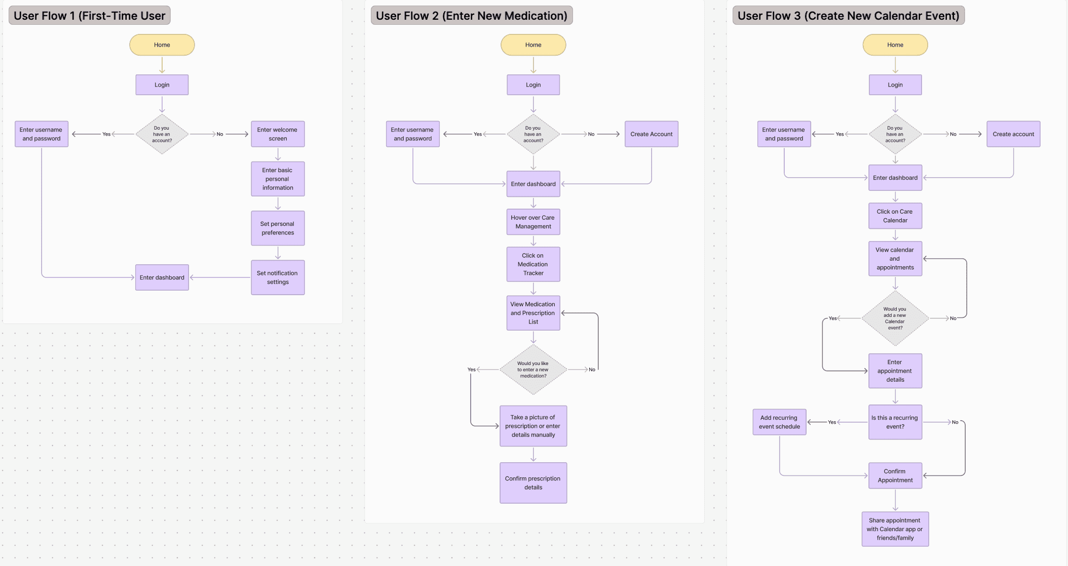
Based on insights from card sorting and user research, I developed user flows to map how users navigate through the website. This structure ensures a clear, intuitive experience, making it easier for users to find and access caregiving resources efficiently.
Splash
Welcome
Sign Up / Log In
Country
Phone number
Continue with email
Continue with Google
Continue with Facebook
Continue with Apple
Verification
Bottom Nav Bar
Wishlist / Favorites
Chat / Messages
Search / Home
Booking
Profile
Home / Search
Search Bar
Filter & Sort
Provider Cards
Map View
Featured Providers
Booking
Date & Time Picker
Confirm Booking
Payment Method
Booking Summary
Digital Check-In Card
Profile
Personal Details
Health Records
Notifications
Payment Methods
Settings & Privacy
User Flow
Task Flow

Design Process
Early Wireframes
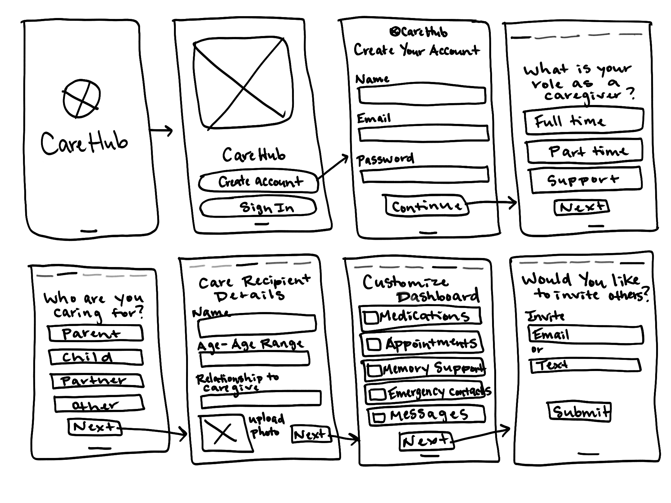
I began with rapid sketching to explore different layouts and navigation patterns. These low-fidelity wireframes helped establish the basic structure and user flows.
Dashboard sketch
App Sketch

UI Kit
Sage
#5A8F8F
Light Pink
#D9B3EE
Light Sage
#A9D9C8
Cream
#f4ede4
Charcoal
#0a0f0d


Low-Fidelity Designs
Digital wireframes focused on information hierarchy, spacing, and interaction patterns. At this stage, I tested usability without the distraction of colors or detailed visuals.
Care Hub
Care Hub
Create Account
Sign In
Care Hub
Create Your Account
Name
Email Address
Password
Retype Password
Continue
Back
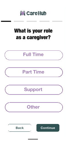
Care Hub
What is your role
as a caregiver?
Full Time
Part Time
Support
Other
Continue
Back
High-Fidelity Designs
Onboarding
Onboarding system that personalizes the app for the user



Dashboard
A centralized hub that keeps caregivers organized, highlighting key tasks, schedules, and updates while providing seamless access to essential tools.


Search
Care Recipient
Margaret
Smith
Age
Health Status
Primary Care
Doctor
88
Dementia
Dr. Langdon
Alert
Patient Files
Calendar
Dec
Good Morning Jane!
Explore Care Library
Dec 17, 2025
2 Medications today
Unread Messages
Sun
1
Mon
Tues
Wed
Thu
Fri
Sat
2
3
4
5
6
7
Sophia wrote
“Are you driving grandma
to her appointment today
or should I?”
Respond
Search
Home
Calendar
Tasks
Medication
Reminders
Messages
Settings
Jane Doe
Care Team
Contacts



Caring for a Loved One
with Dementia or
Alzheimer's
Caring for a Loved One
with Dementia or
Alzheimer's
How to get the best
aid when it is needed
After a hospital discharge,
talk to your doctor


1
2
3
4
5
6
7
8
9
13
14
10
11
12
31
30
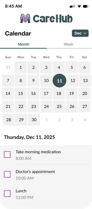
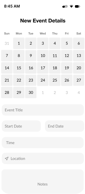
Creating New Calendar Events
Users can create new calendar events, turn on reminders, and it can be shared with family, friends, and contacts




CareHub
A user-centered dashboard that supports caregivers
UX Research
UI Design
Prototyping
Usability Testing

My Role
Led user research
Created a new design system
Created wireframes, mockups, and prototypes
Ensured accessibility was practiced and the product is inclusive to all users
Timeline
4-5 weeks
tools
Figma, Figjam, Adobe
Illustrator, Zoom, Calendly,
Phone Calls
CareHub Explained
Many caregivers feel overwhelmed and disorganized, which can lead to burnout, exhaustion, and uncertainty about where to turn for support. Essential tools, such as resources, planners, and medication reminders, are often scattered across different platforms, adding the stress of keeping track of everything.
How does it work?
Values-Based Discovery — Users search for care using filters designed for the healthcare context
Radical Verification (The Trust Layer) — Patients verify providers through credentials, reviews, and visit consistency scores
Localized Care Ecosystem — CareHub integrates directly with local pharmacies and insurance providers
Frictionless Check-In — Once booked, the user receives a Digital Health Card with directions and a direct 'Call Clinic' button
Who is CareHub made for?
Anyone managing chronic conditions, acute care, or preventive health visits — especially domestic patients with complex care needs
Primary user flow is optimized for patients managing multiple providers; booking, medication reminders, and safety indicators address specific needs
As the platform grows, future iterations will expand to support caregivers, elderly users, and pediatric families
Design Thinking
Process
Empathize
Stakeholder Research
Competitive Analysis
SWOT Analysis
User Research
Empathy Map
Persona
User Journey
Define
Problem Statement
Goals
Pain Points
Ideate
Brain Storming
Priority Matrix
Features List
Value Proposition
Information Architecture
Prototype
Lo-Fi Wireframe
Hi-Fi UI Design
Test
Usability Testing
Goals
CareHub is an all-in-one dashboard designed to centralize everything caregivers need in one place. By bringing essential tools together, the app reduces the stress and disorganization that often comes from managing multiple responsibilities across different platforms.
Key Objectives
01
Create an intuitive dashboard that keeps caregivers organized
02
Enable seamless communication between caregivers, family, and healthcare providers
03
Provide easy access to essential resources and information in one place
04
Reduce cognitive load and help caregivers feel more in control
05
Design a calming, accessible interface that reduces stress rather than adding to it
Brainstorming
Research
User Surveys
I surveyed five participants, including three caregivers, one individual with over 50 years of experience in healthcare, and one social worker. Their insights were invaluable in helping me better understand the challenges caregivers face.
90%
Feel overwhelmed by caregiving tasks
73%
Use 3+ apps or methods to stay organized
80%
Miss important tasks or appointments
100%
Want a centralized communication tool
1
How often do you struggle to navigate the healthcare system?
90% — Frequently struggle
10% — Rarely struggle
2
What is your primary age range?
35% — 18–24
45% — 25–44
20% — 45+
3
How often do you miss appointments or doses?
73% — Once a year+
18% — Rarely
9% — Never

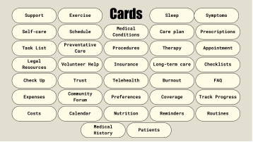
Card Sorting
I conducted open card sorting sessions with participants to understand how caregivers naturally group information and features.
User Personas

Information Architecture
Based on insights from card sorting and user research, I developed user flows to map how users navigate through the website. This structure ensures a clear, intuitive experience, making it easier for users to find and access caregiving resources efficiently.
Splash
Welcome
Sign Up / Log In
Country
Phone number
Continue with email
Continue with Google
Continue with Facebook
Continue with Apple
Verification
Bottom Nav Bar
Wishlist / Favorites
Chat / Messages
Search / Home
Booking
Profile
Home / Search
Search Bar
Filter & Sort
Provider Cards
Map View
Featured Providers
Booking
Date & Time Picker
Confirm Booking
Payment Method
Booking Summary
Digital Check-In Card
Profile
Personal Details
Health Records
Notifications
Payment Methods
Settings & Privacy
User Flow
Task Flow
Design Process
Early Wireframes
I began with rapid sketching to explore different layouts and navigation patterns. These low-fidelity wireframes helped establish the basic structure and user flows.
Dashboard sketch
App Sketch
UI Kit
Sage
#5A8F8F
Light Pink
#D9B3EE
Light Sage
#A9D9C8
Cream
#f4ede4
Charcoal
#0a0f0d
Low-Fidelity Designs
Digital wireframes focused on information hierarchy, spacing, and interaction patterns. At this stage, I tested usability without the distraction of colors or detailed visuals.
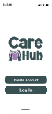
Care Hub
Care Hub
Create Account
Sign In
Care Hub
Create Your Account
Name
Email Address
Password
Retype Password
Continue
Back
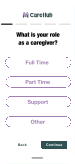
Care Hub
What is your role
as a caregiver?
Full Time
Part Time
Support
Other
Continue
Back
High-Fidelity Designs



Dashboard
A centralized hub that keeps caregivers organized, highlighting key tasks, schedules, and updates while providing seamless access to essential tools.

Search
Care Recipient
Margaret
Smith
Age
Health Status
Primary Care
Doctor
88
Dementia
Dr. Langdon
Alert
Patient Files
Calendar
Dec
Good Morning Jane!
Explore Care Library
Dec 17, 2025
2 Medications today
Unread Messages
Sun
1
Mon
Tues
Wed
Thu
Fri
Sat
2
3
4
5
6
7
Sophia wrote
“Are you driving grandma
to her appointment today
or should I?”
Respond
Search
Home
Calendar
Tasks
Medication
Reminders
Messages
Settings
Jane Doe
Care Team
Contacts


Caring for a Loved One
with Dementia or
Alzheimer's
Caring for a Loved One
with Dementia or
Alzheimer's
How to get the best
aid when it is needed
After a hospital discharge,
talk to your doctor


1
2
3
4
5
6
7
8
9
13
14
10
11
12
31
30
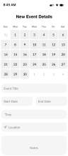
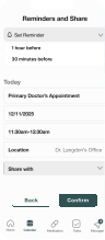
Creating New Calendar Events
Users can create new calendar events, turn on reminders, and it can be shared with family, friends, and contacts



Designing CareHub taught me that great UX design isn't about adding features, it's about deeply understanding people's lives and creating solutions that genuinely help them. The most rewarding moment was hearing a user say, "This would actually make my life easier."
Let's Work
Together.
Let’s Work
Together.
Have a project in mind or just want to say hello?
I'd love to hear from you.
Have a project in mind or just want to say hello?
I’d love to hear from you.
katiewmcdonnell@gmail.com
